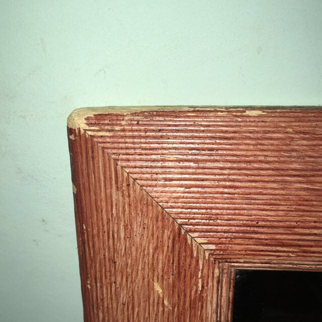
Edges.
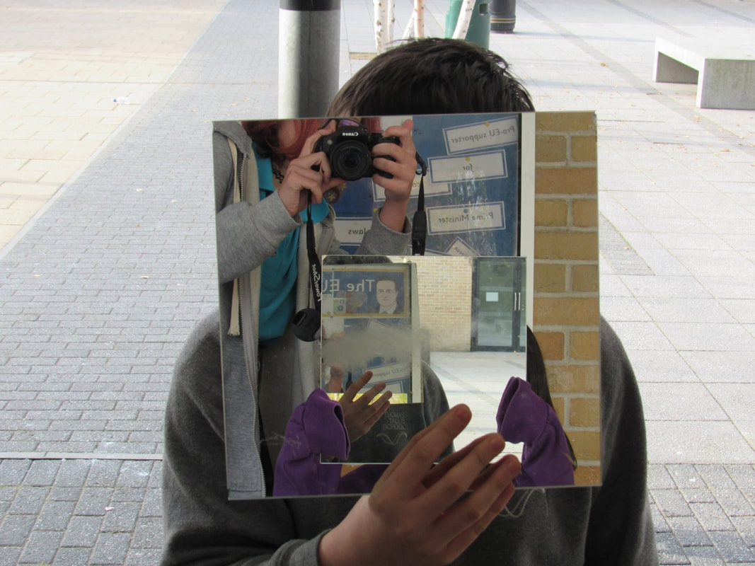
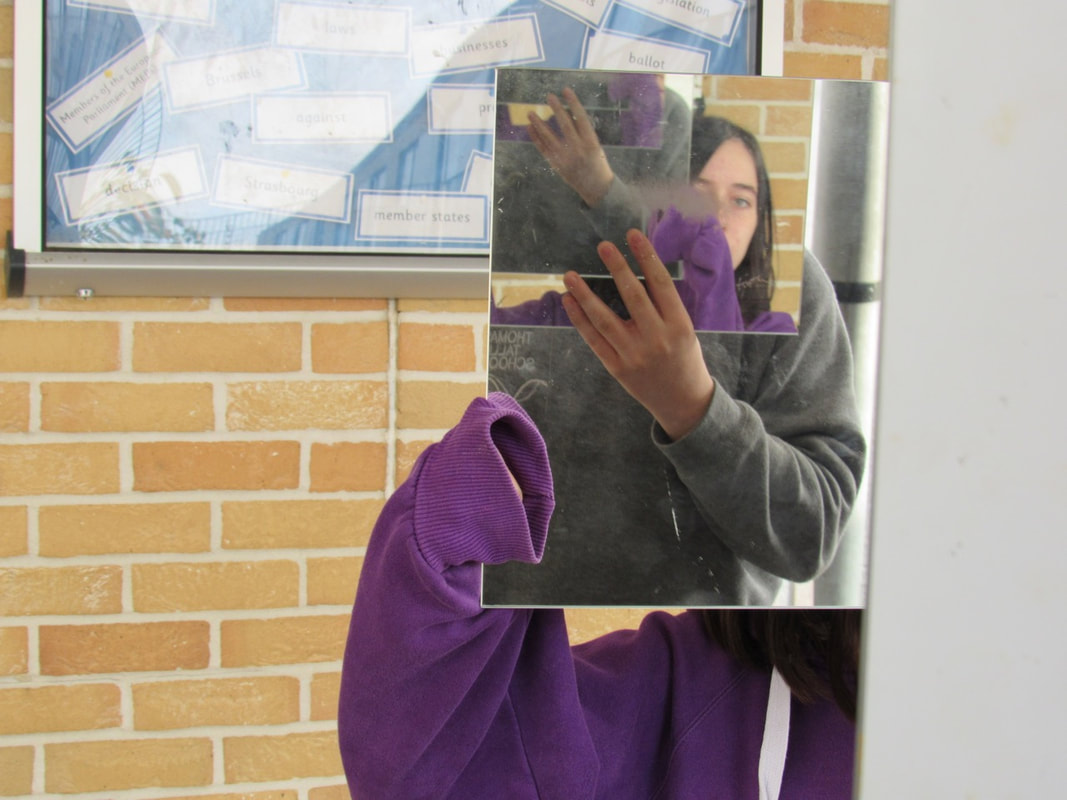
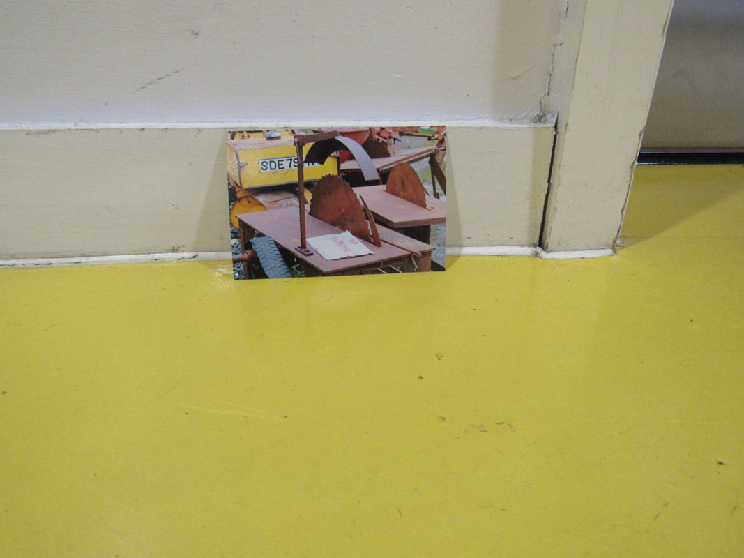
These photos are of Edges, for two lessons we went out to take photos with mirrors. We were in pairs, so I worked with Meghan and Jake. We had to use two mirrors and two cameras so we got more effective photos.
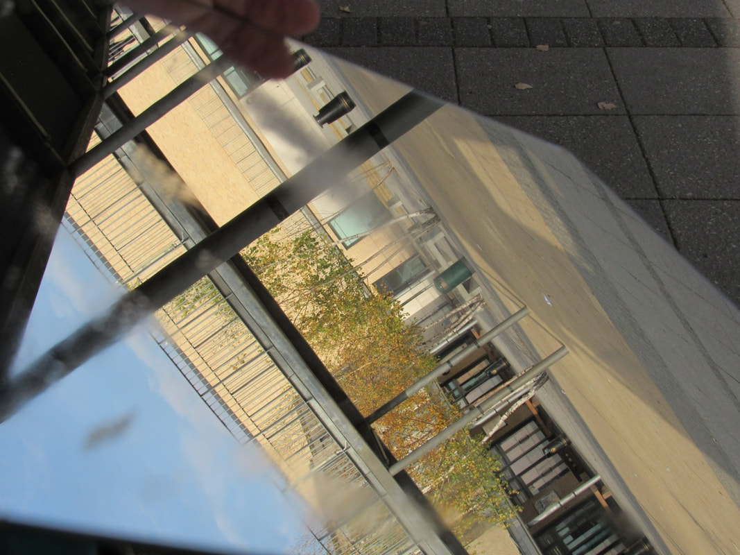
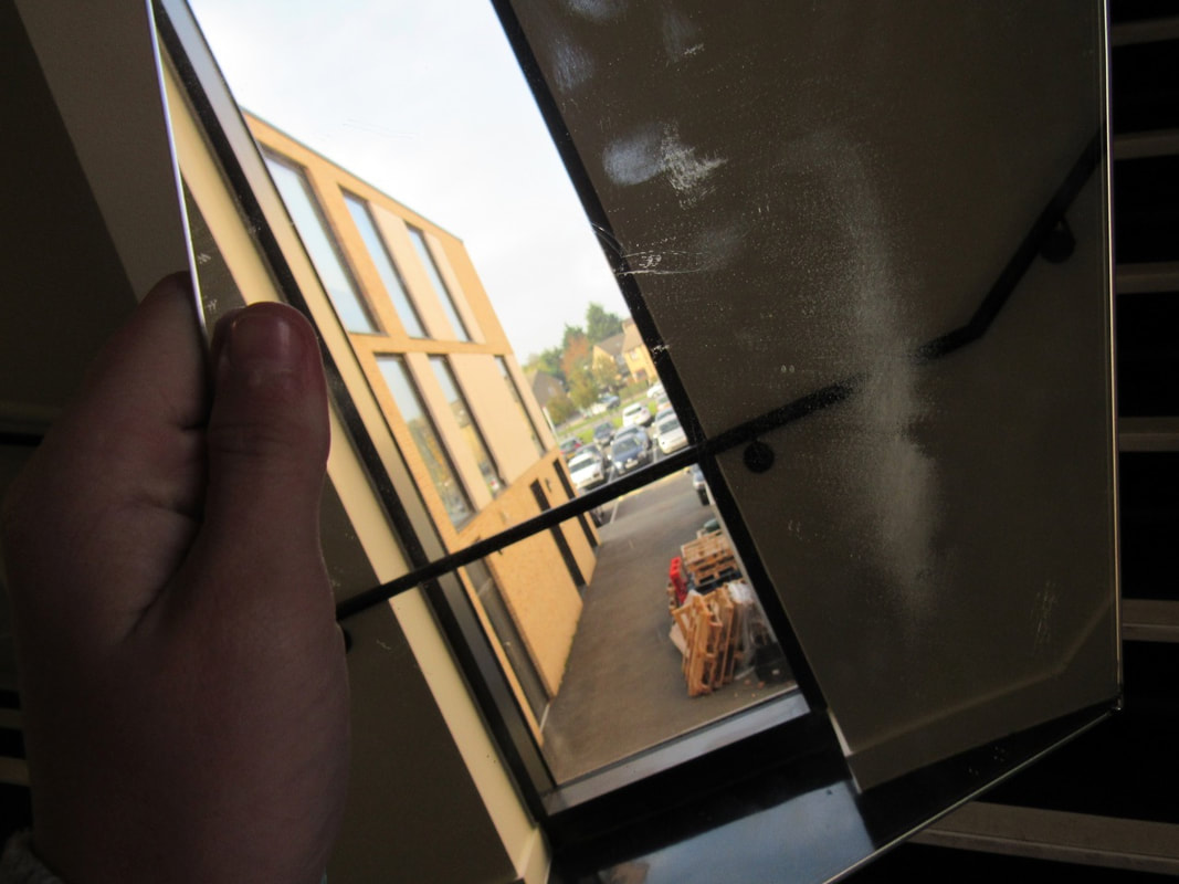
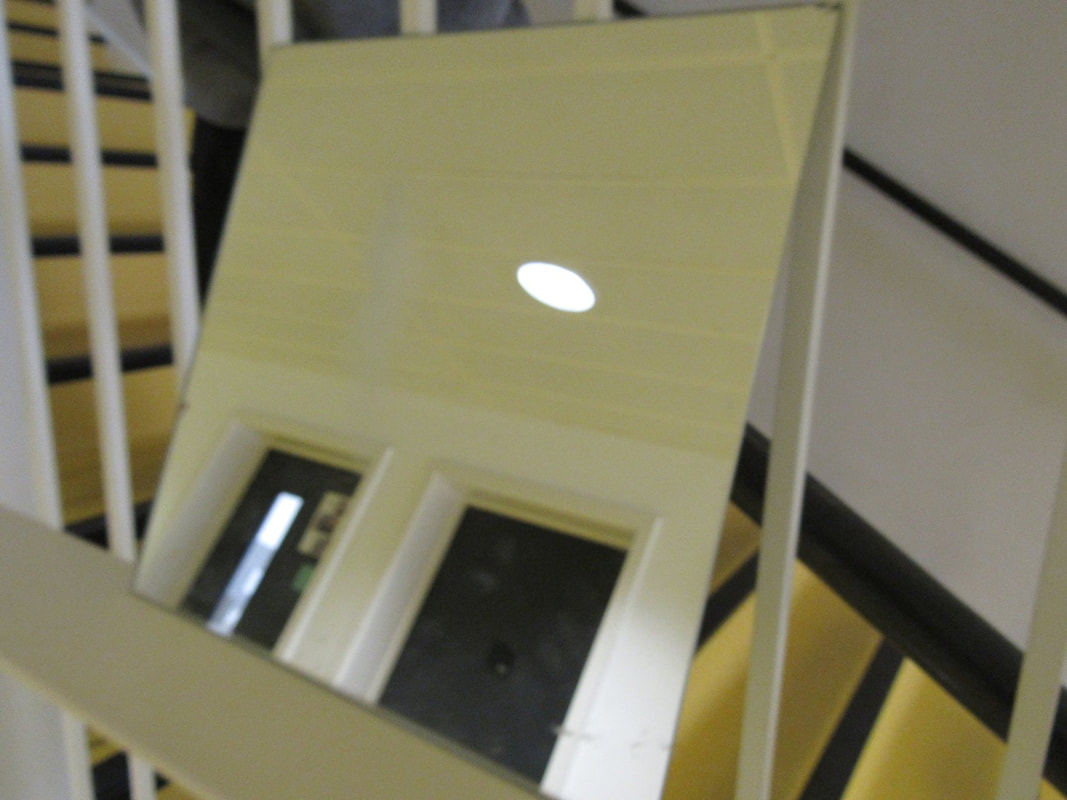

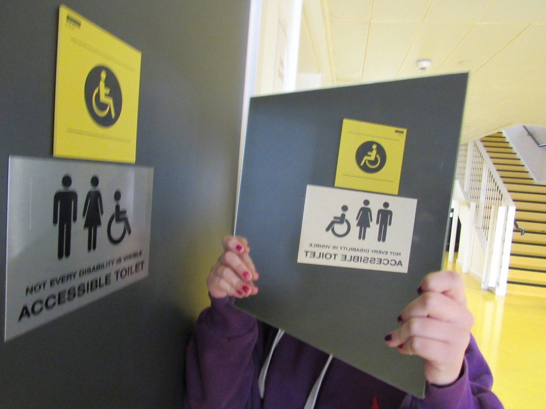
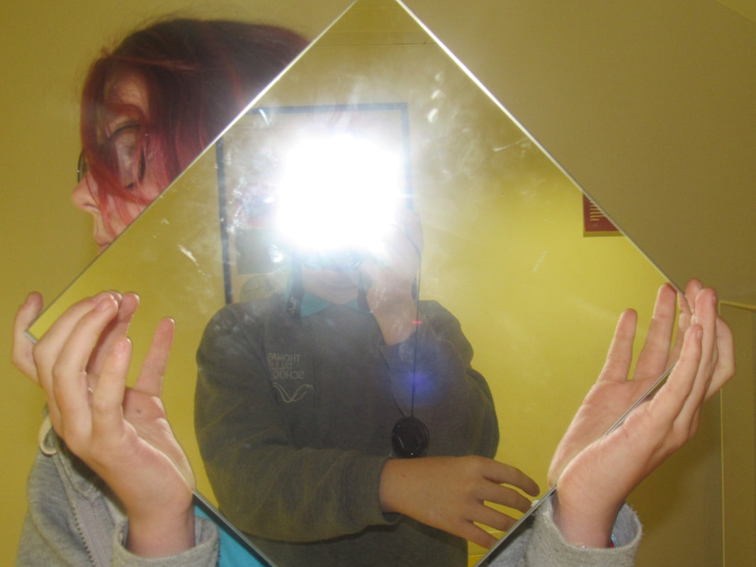
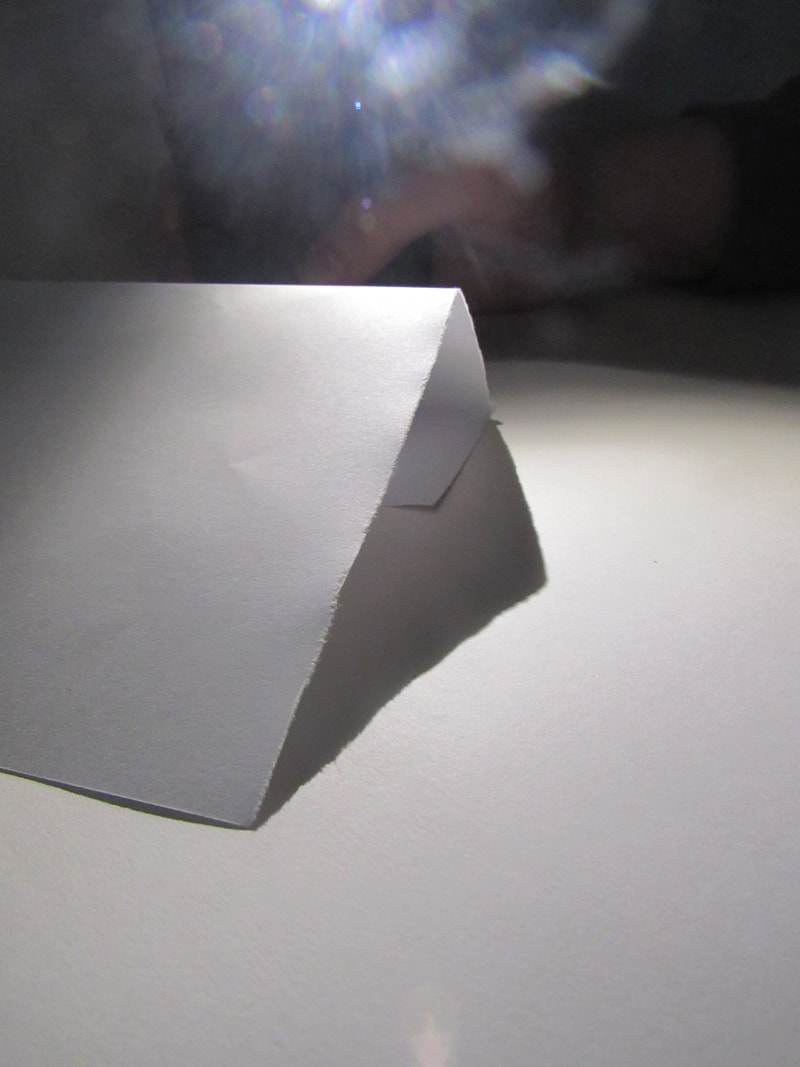
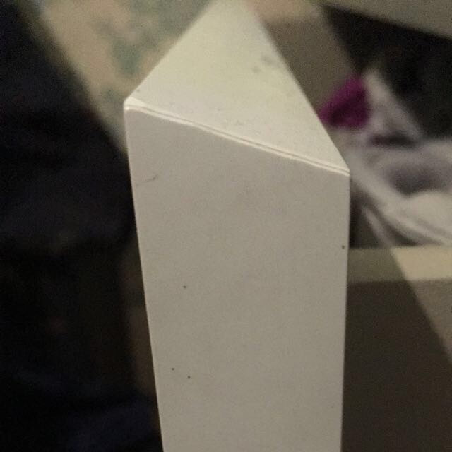
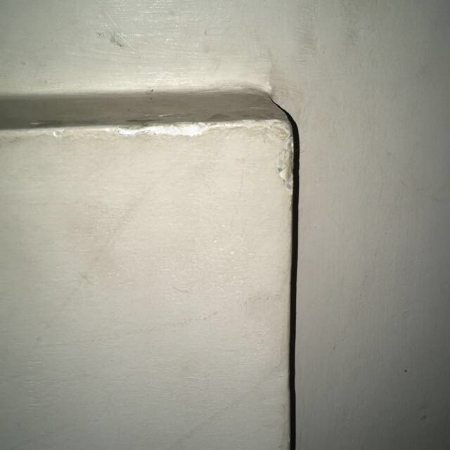
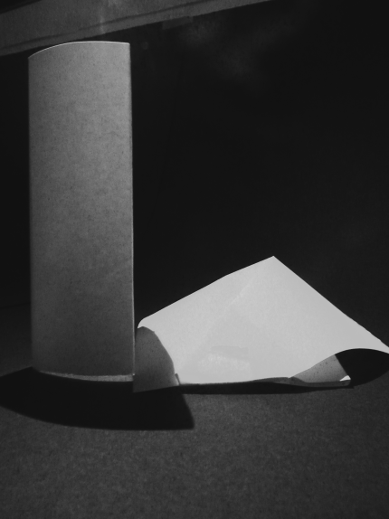
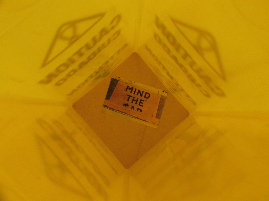
This is my favourite photo because the mirror is the main subject, there is nothing surrounding it. You can see only things inside of the mirror not the outside.
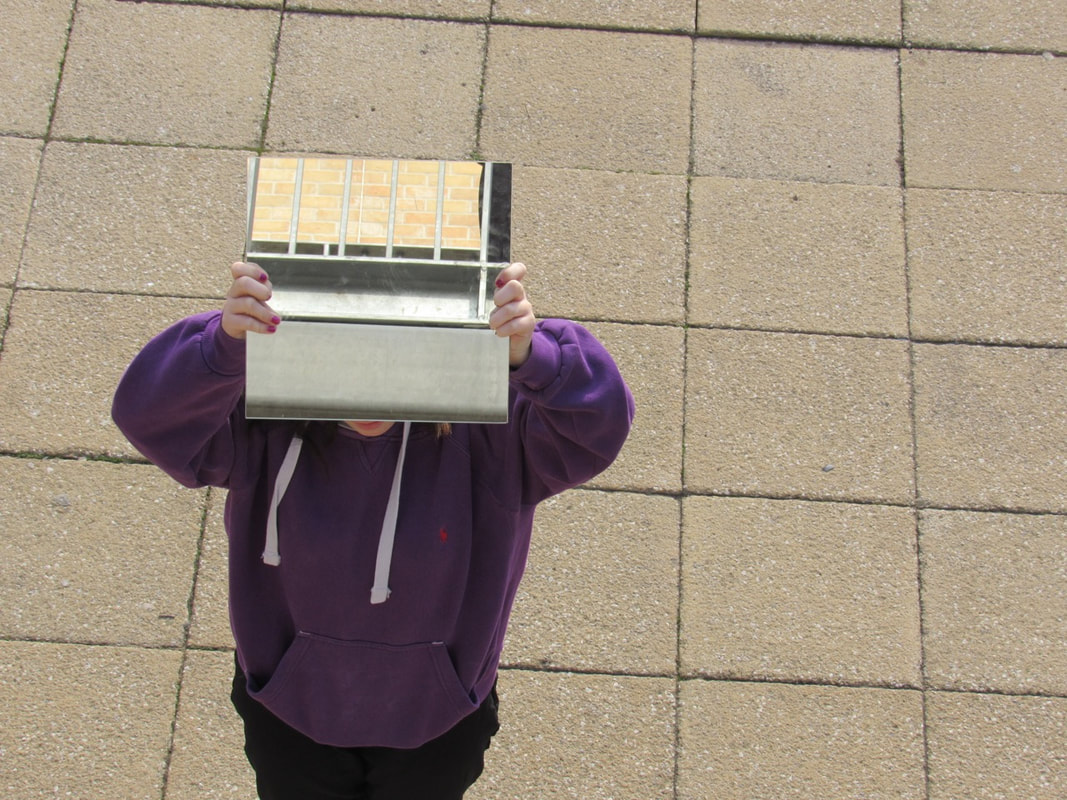
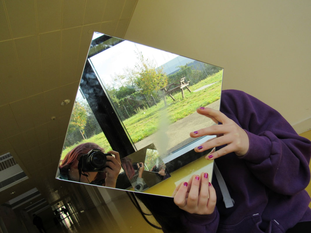
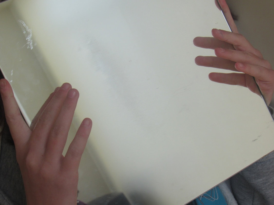
I could take much more detailed photos and only have one subject I'm focusing on, and try not to show my face as its drawing attention. I shouldn't be in any photos as its distracting.
I could take much more detailed photos and only have one subject I'm focusing on, and try not to show my face as its drawing attention. I shouldn't be in any photos as its distracting.
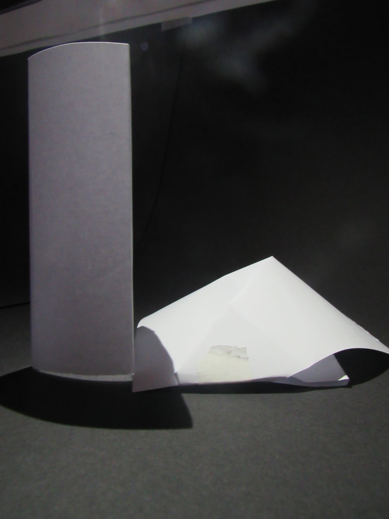
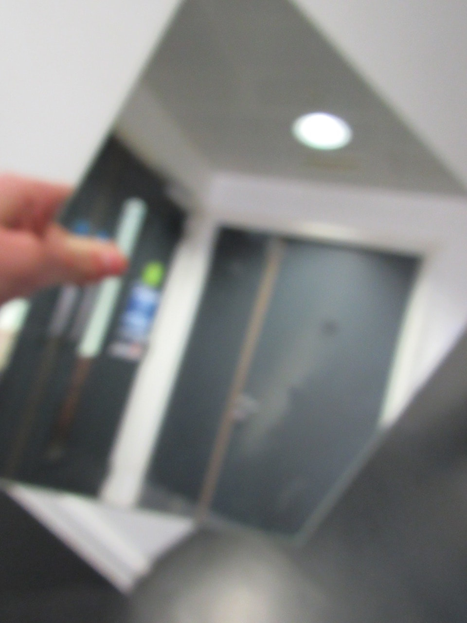
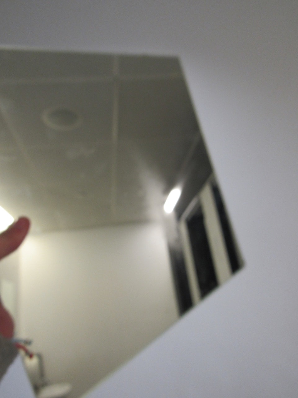
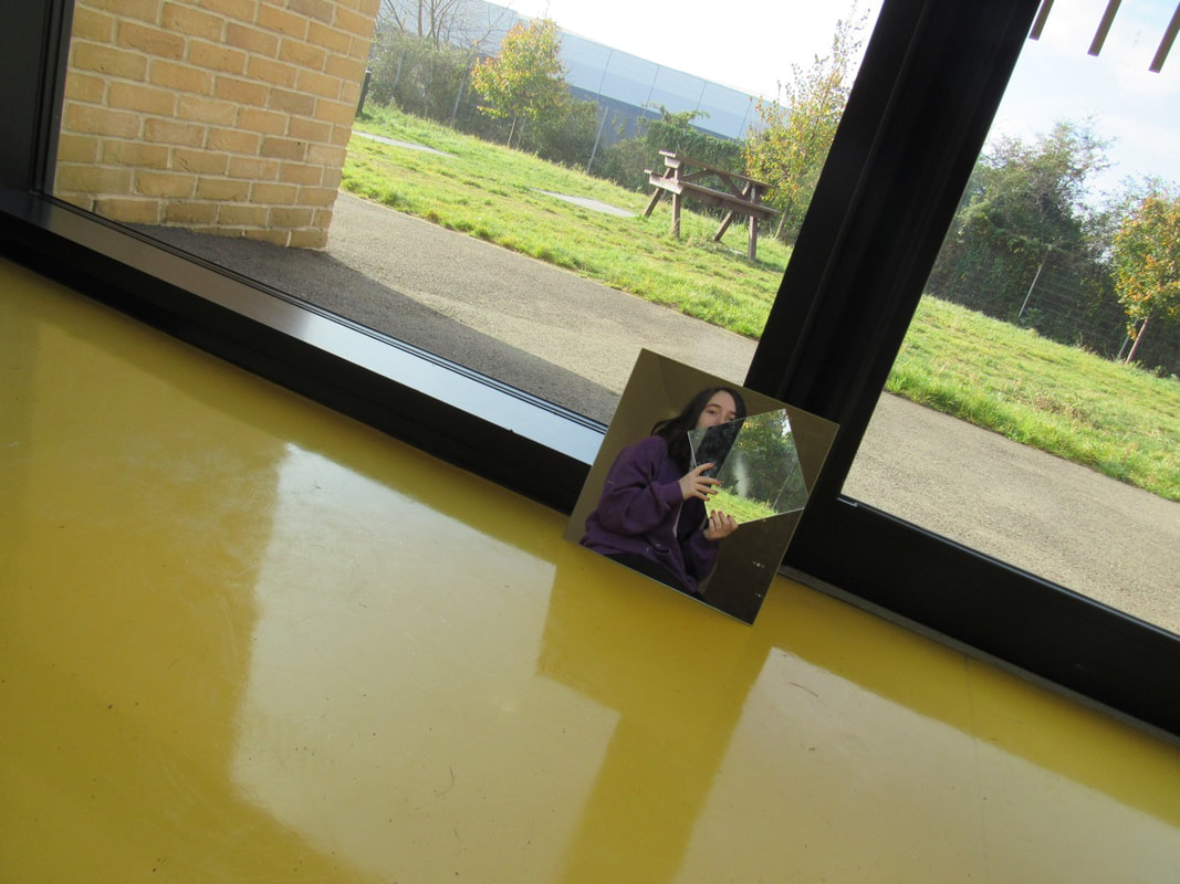
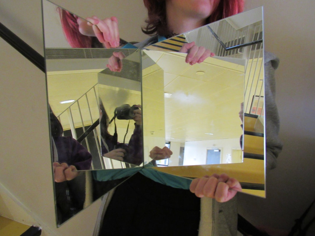
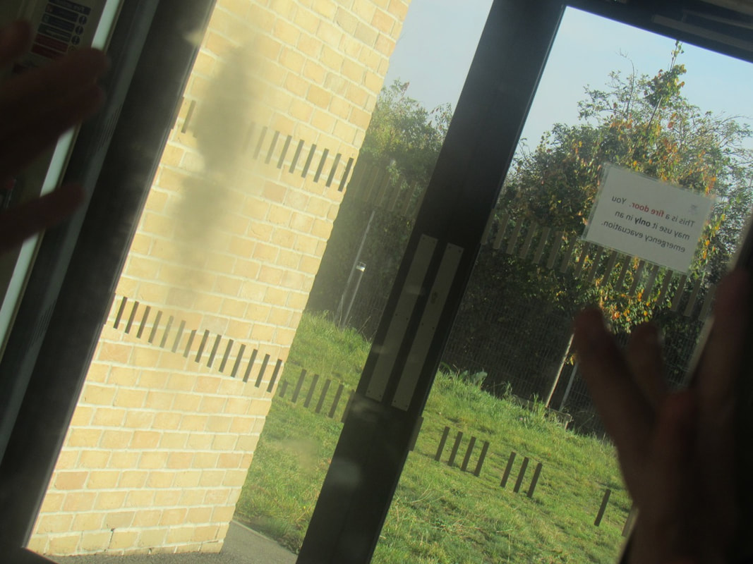
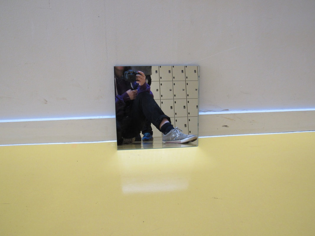
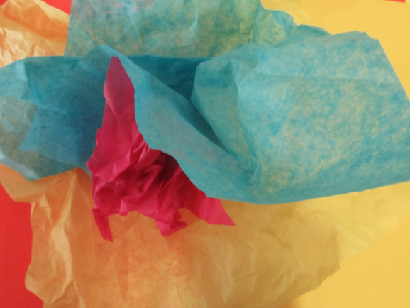
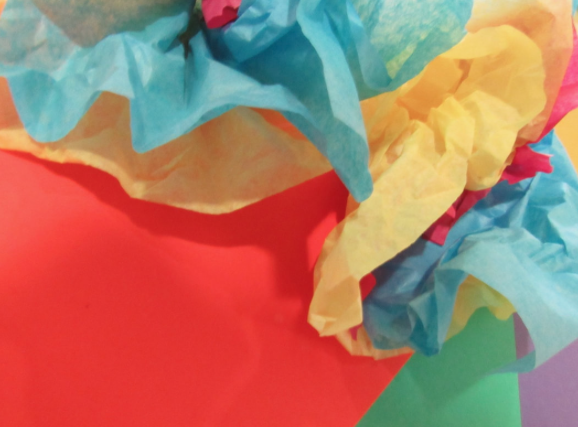
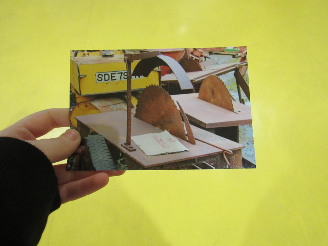
These are the photos I took for homework. I had decided to use different shapes and sizes, which caused a lot of variation of pictures. These were the best photos I had taken, but I had added some photos which I didn't mean to take, but look good anyway.
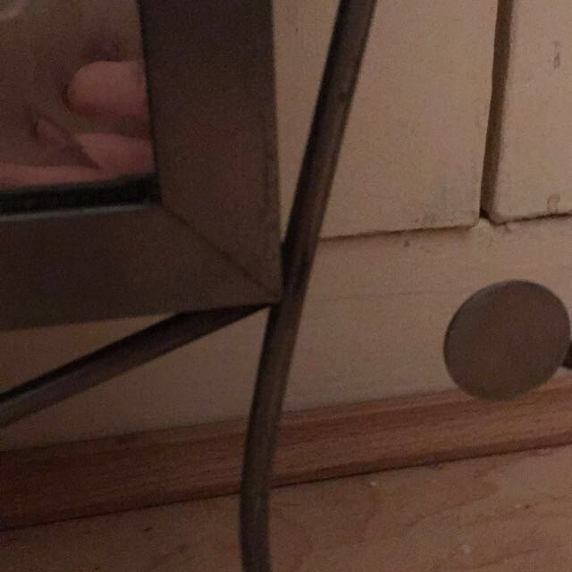

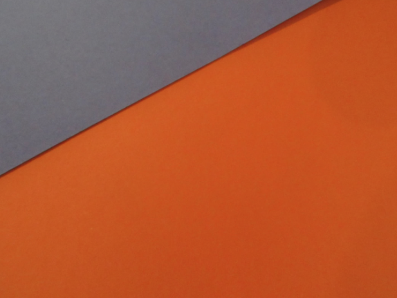
This photo was an accident, as it was a sweet wrapper. My sister gave me the idea, I placed the camera close to the sweet wrapper which was orange. I think it turned out well, and I'm sure that the photos I have taken are different to others.
But, I also think I could've done better, maybe thought of different things to take a photo of, which isn't inside of my own home. I could've went outside and taken more adventurous photos.
But, I also think I could've done better, maybe thought of different things to take a photo of, which isn't inside of my own home. I could've went outside and taken more adventurous photos.
MY EDITING
I cropped this picture and made the shadows darker and the highlights lighter, I also tested out the exposure but I didn't like it.
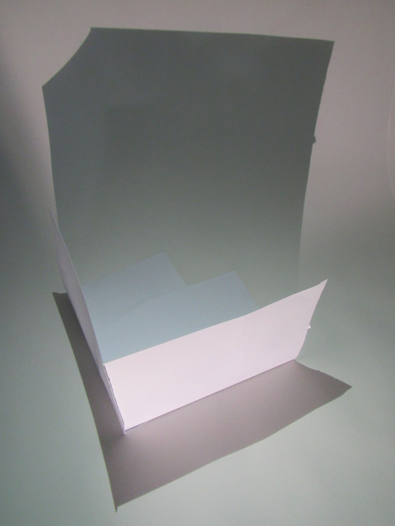
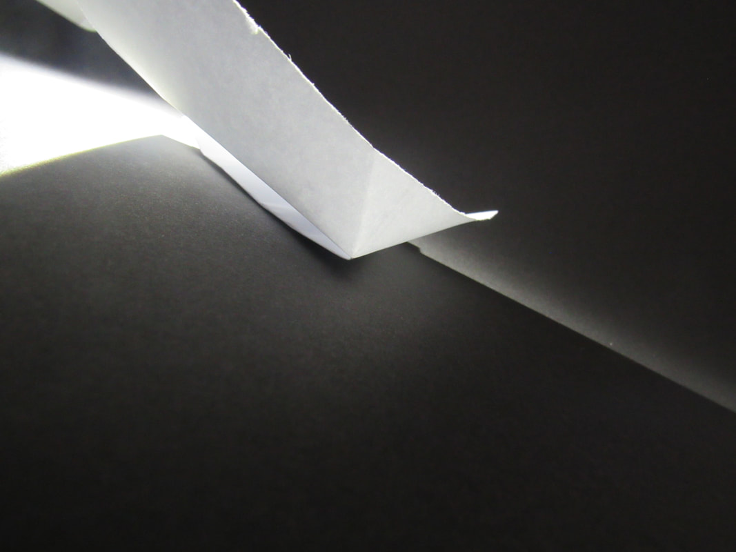
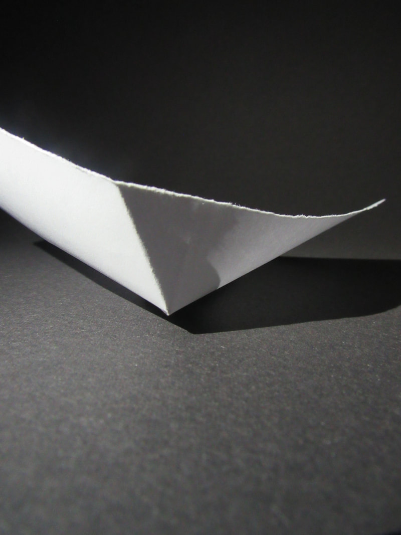
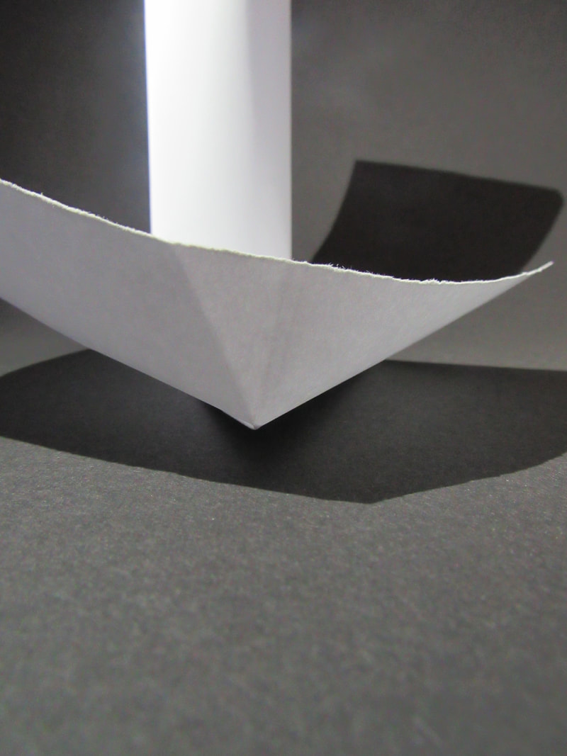
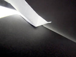
Colour folds.
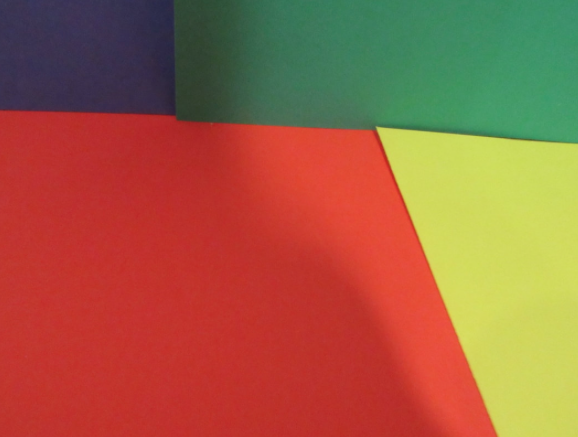
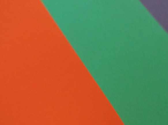
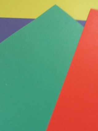
Me and my partner, Megan had decided to make a bunch of different images with the coloured paper.
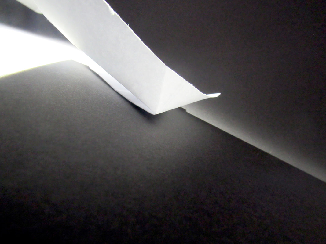
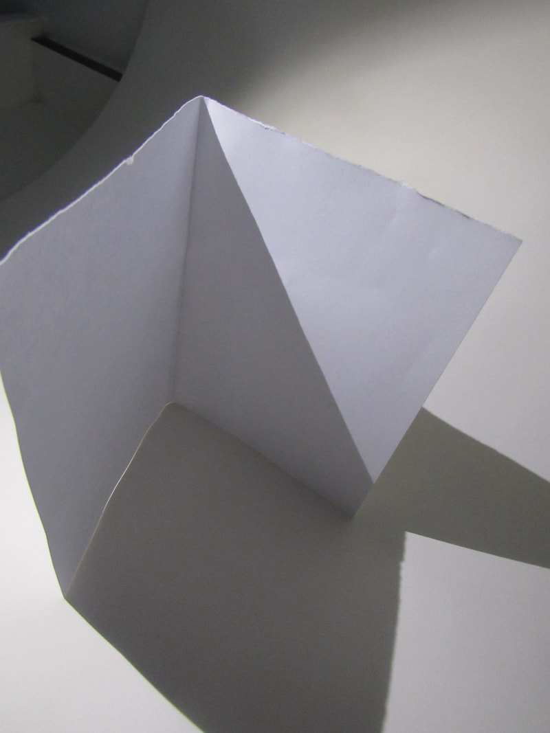
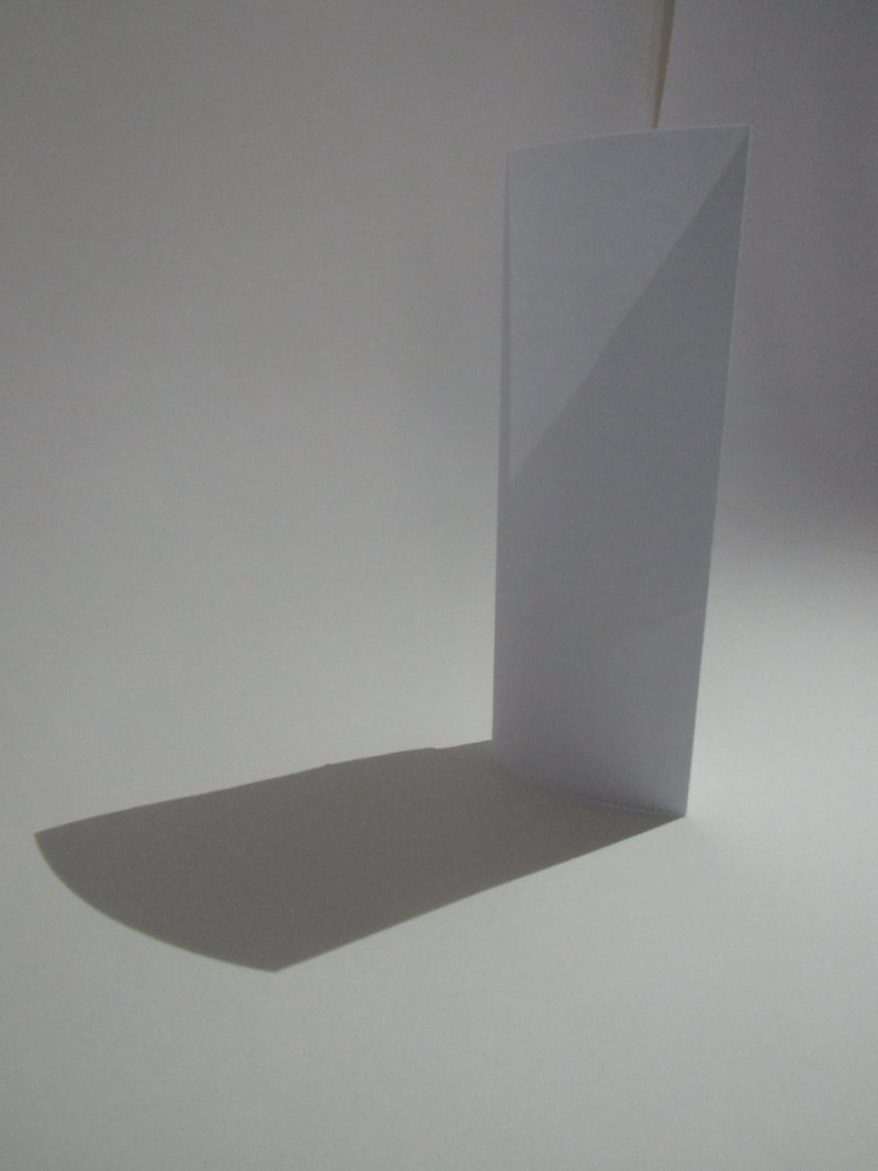
This is my favourite photo from the edges, I think theres a lot of definition. You can also see the shadows clearly and where the light is coming through the paper.
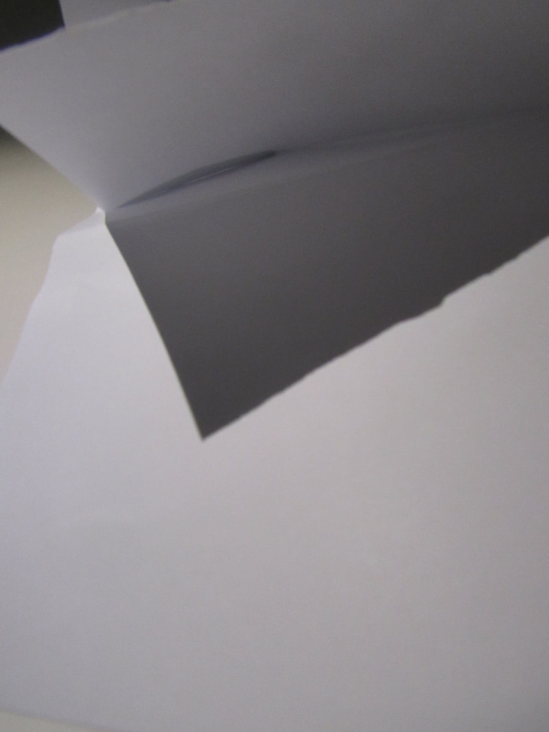
I think I could do much more better photos, and more vibrant and detailed work. I think I could add more paper, and shape it differently and make it.. not plain!
I think I could do much more better photos, and more vibrant and detailed work. I think I could add more paper, and shape it differently and make it.. not plain!
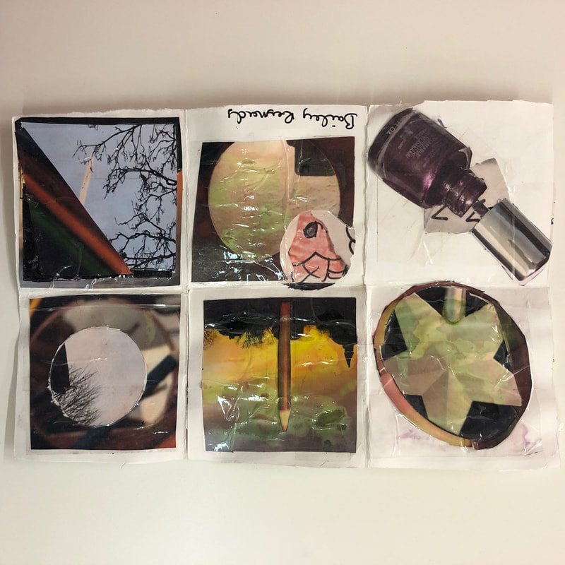
This is my concertina book, I think overall it looks rather messy because of the shapes of the photos and how the circles are not at all perfect. but I also think the photos I HAD taken in general look generally good because of the photos and I was running low on ink whilst printing off them. In general, my concertina book looks decent enough. although I could've done better.
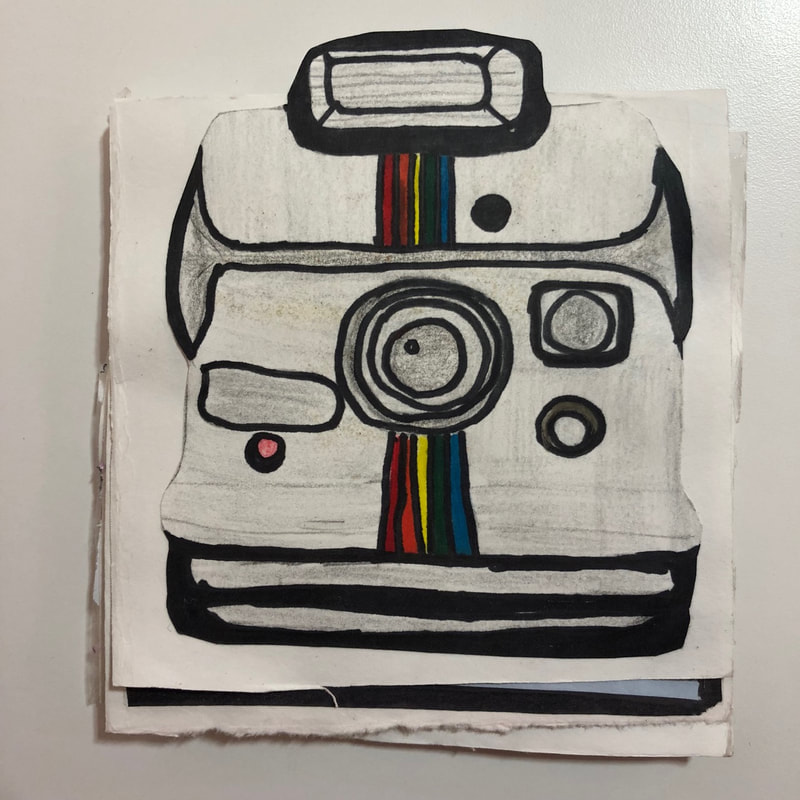
WWW: the images and my drawing of a camera! It looks very fine and neat!
EBI: I still think I could do better, because its a little rugged at the edges and messy.
WWW: the images and my drawing of a camera! It looks very fine and neat!
EBI: I still think I could do better, because its a little rugged at the edges and messy.
Assessment- edges.
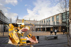
With our photos, we were asked to make a sculpture with them. So with my photos which were yellow, I made sure they were blended together so you wouldn't know the difference between what photos. I used a scalpel and scissors and tape to shape and create the sculptor.
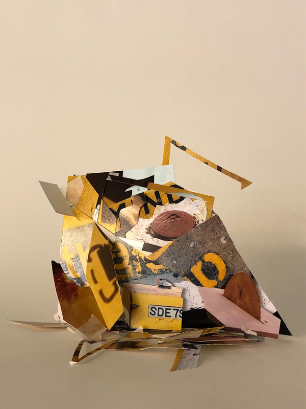
In this piece, I have a variety of shapes which cause the sculptor to be quite abstract. We all had different ideas which lead to very different sculptors which look very unique. My initial idea was far different from the thing you look at above, I was hoping for it to turn out with much less use of the photo I had cut up but it lead to this, which looks wonderful because of the colours that blend together. But also using tape as apart of the sculptor itself. We all had to make sure our sculptor could stand so that meant we could cut up several small pieces of a photo and use that as the base, with the finished product, I'm very proud of it as yellow is my favourite colour and the sculptor turned out much more better than I'd thought.
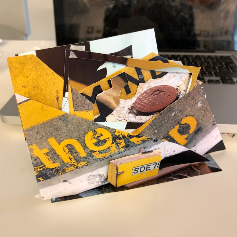
This was the after we had break, and I hadn't exactly knew how to make my sculpture. it was just, art In progress, you could say. but the after math was messy with tape and small tiny pieces of the photos that were so small that you couldn't stick it to the photos.
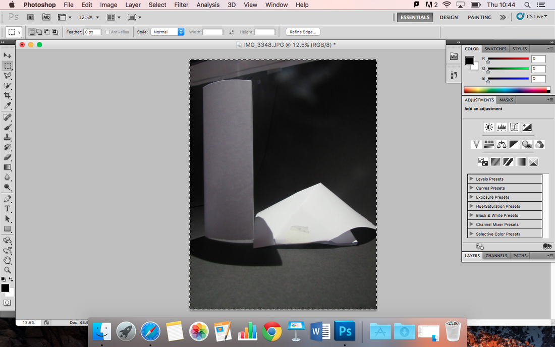
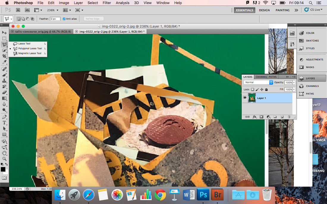
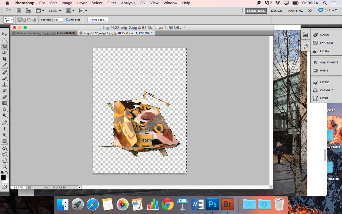
Photoshop in process.
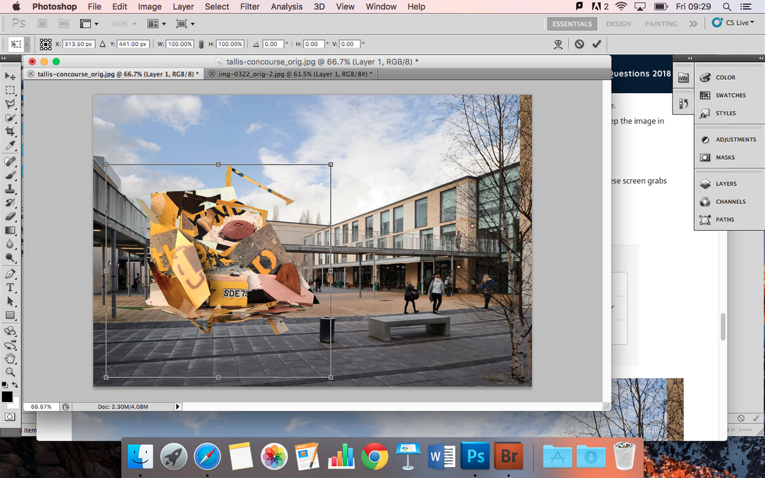
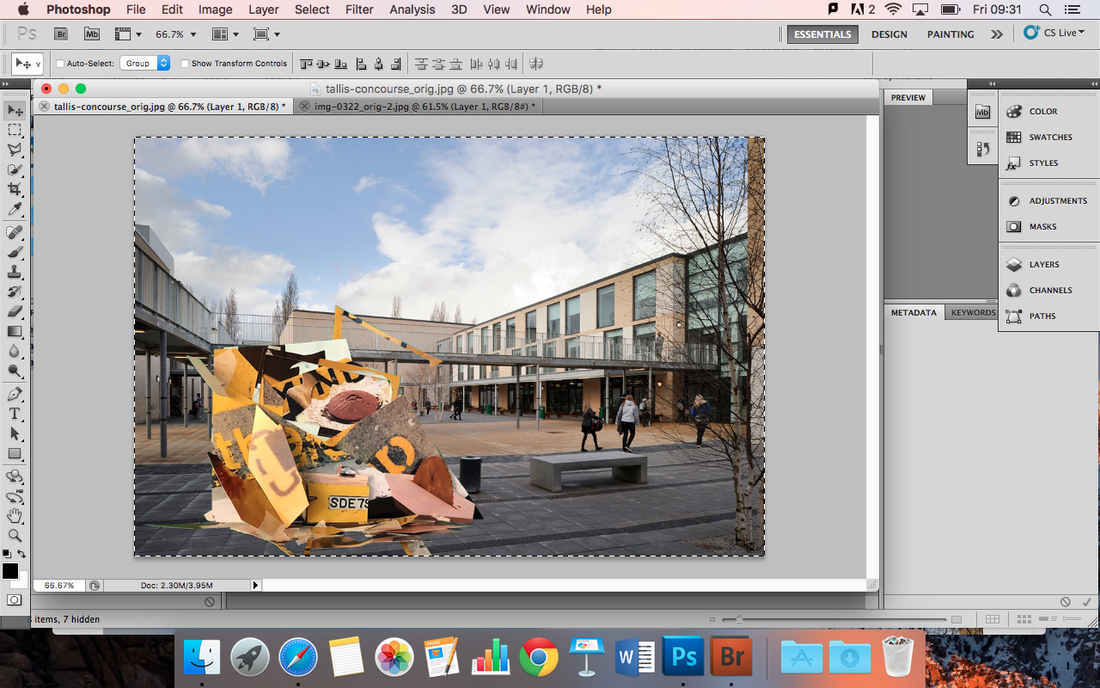
This is the finished photoshop edit.
WWW: I think I done an overall good job on it, I knew how to cut and crop the image and then paste it to another photo which taught me something.
EBI: I could've blended the sculpture to the image by turning down the contrast as it looks rather fake but also how the pavement tilts, I think I will try to edit the colour so it'll look much better.
FINAL EVALUTATION.
The total project was fun, I think the assessment had its up and downs. I got stuck on some things but I knew how to cope and it helped me make the sculpture better. It also taught me many things, like how to edit on photoshop and remove any background you don't want and how to copy, cut and paste.
I think it made us better with our photograpghy, we took photos of the sculptures we made and with all of our different ideas, it makes it much more fun. I think I done well, maybe could've done a much better job with cutting out and cleaning it up but I think it looks good and it could lead to me having a good grade.
I think it made us better with our photograpghy, we took photos of the sculptures we made and with all of our different ideas, it makes it much more fun. I think I done well, maybe could've done a much better job with cutting out and cleaning it up but I think it looks good and it could lead to me having a good grade.
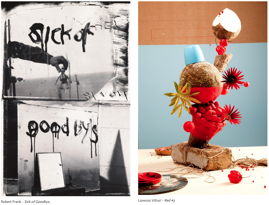
"Sick of Goodbys" is chaotic , almost an illusion. In Frank's photo, he has given us an idea about his image. it represents loss, and hurt. But also has given us idea about having an object in the centre of the picture which you wouldn't realise at first glance. Frank had an idea, and he knew what was in his image and how he wanted the world to view it. His image is portrait format even though his photo sums up of two images together. It is very grim, as the contrast is dark, bleak. His image looks like an illusion, as the only thing that is real is the writing. Which then makes you contemplate what you're actually looking at, The other image below the top of Frank's photo is almost as if he is hinting that what you're looking at is further than you think. There is a mirror against a mirror against a mirror so he portrays the image as almost abstract.
Red #1 is vivid, unlike Frank's photo, Viturri has given us a still life image. The amount of objects differs, almost building a sculpture with the objects. Viturri has picked various of colours but the one he has picked the most is possibly red. It's on the flowers and the strange ball that is sat atop the sculpture. There are similar ideas within the two images. They both have an object within the image, which in Frank's isn't actually there, but further away. Within Vitturi's image, he has chosen a range of tricks. For example, how the background blends within the sculpture. He also uses texture and tone within it. But so does Frank, he uses tone and texture, and also how it focuses on the hand writing within the image which us much closer then the other objects in the background that look like they're there but aren't.
In Frank's image there are many edges there. It would be because of the shadows portraying the image but also the shape of the image itself. in every photo, there has to be a finishing point, an edge in that specific photo. Many people have questions but why put a figure in an image and join fruit of some sort together? Also, In Vitturi, the stand the sculpture is standing on is edgy and also where the table meets the wall and where the wall meets the ceiling.
In image 1, Frank's image. I think he purposely spells goodbye as goodbye. The title could be different, maybe something that could mean abstract. or something like 'dreaming is practise for immortality' It describes the image as being unreal and not there. These images describe many things like how no matter how different the images are. There are always similarities, The atmosphere is overwhelming, because of how you feel just by looking at the image.
tate moderN
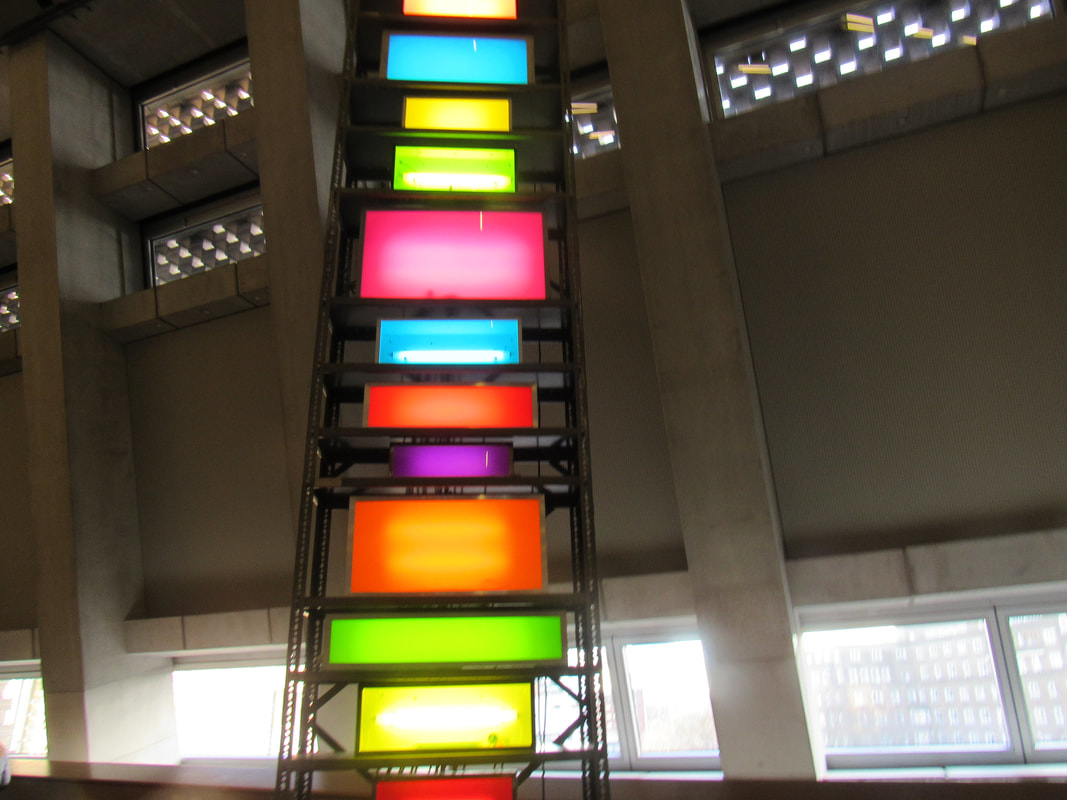
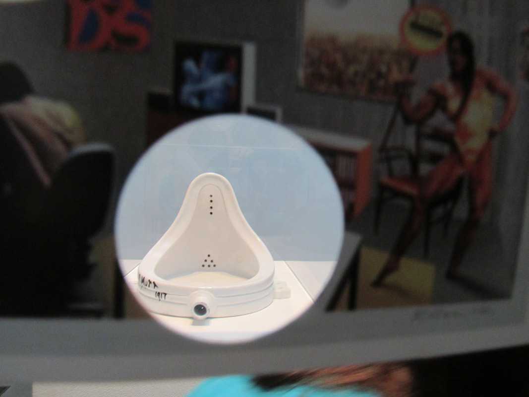
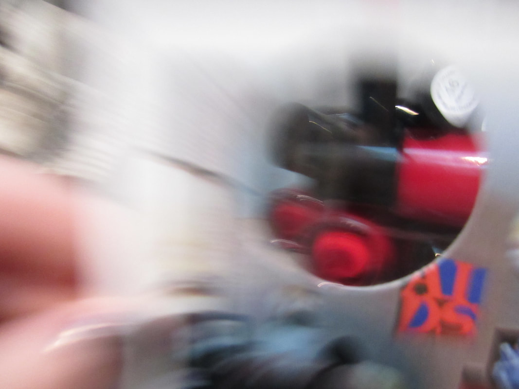
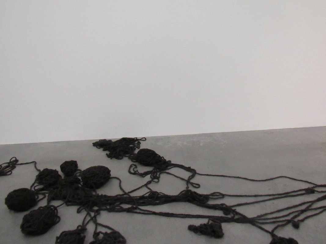
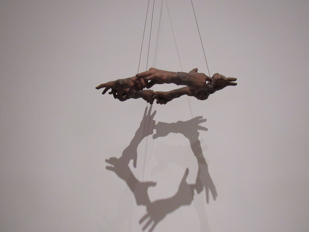
We went to the Tate Modern, where we took many photos to involve art. We spent the whole day in groups, walking around the museum and looking at the expeditions, the sculptures we saw were very deep, almost as if they had a reason for it. Some were very different, and we also saw a swing set inside, which was very fun. We also went to the top of the Tate modern, where we saw all of London, the shard and the thames. Overall, the day was fun and I got to spend it with my friends taking photos.
Photo clipping.
I think my photo clipping was fun, it was very easy and once I got the hang of it I was editing a lot of photos. Since I love editing and making photos in general! I enjoyed changing the colour of those images and then I enjoyed the time I had spent with editing the photos which in general, look fantastic!
WWW: The colouring of the photo, and the shapes and the clipping, which look really good.
EBI: I should create more shapes on the images instead of just one, It should be more colourful too!
WWW: The colouring of the photo, and the shapes and the clipping, which look really good.
EBI: I should create more shapes on the images instead of just one, It should be more colourful too!
